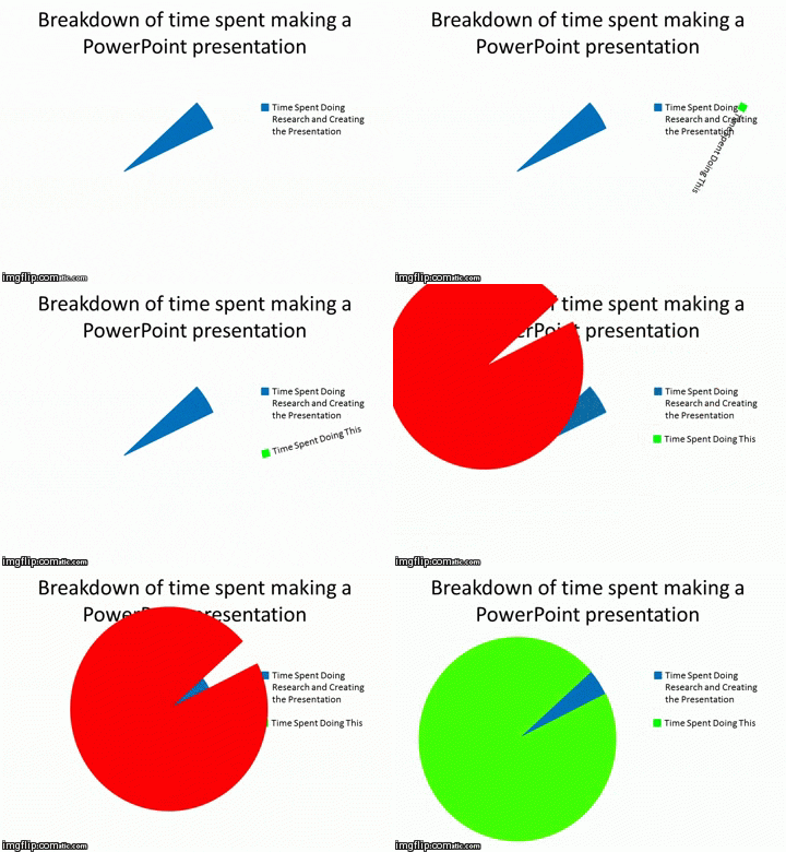
#TechItUpTuesday


PowerPoint is an important part of your digital creation skills. Today we are going to discuss how to use it effectively and create great presentations.
Most of you have probably given the odd presentation at school and you are likely to give more at university and possibly even more in your working life depending on your career path. You may think well my particular field doesn’t really involve presentations so I don’t need to bother. You likely will have to give one at somepoint. For example, even though my main role is writing content like this I did have to give a short presentation when I first started just to introduce myself.
Slide Transitions and Effects:
Transitions and effects often become the focus of attention, which can greatly distract the audience. In addition to this when a presentation contains several of these effects and transitions runs on a computer much slower than the one on which it was created, the result can be slow and often look silly. These effects rarely enhance the message you’re trying to communicate leave the fade-ins, fade-outs, wipes, and dissolves to Hollywood filmmakers.

PowerPoint Graphics (don’t use Clipart)
As PowerPoint is so widely used if you go for clipart graphics it shows a lack of creativity. If you want to use graphics, use your own photographs or better-quality graphics from free image sites like The Noun Project. Screen captures can also add realism when presenting information about a Website or computer program.
PowerPoint Templates are distracting
Templates should be avoided as it forces you to fit all your originality into someone else’s mould. The templates are often distracting and use poor colour combinations. Create your own distinctive look or you could use the university or organisation logo in the corner of the screen. Could you really concentrate on what someone was saying if you were looking at this?

There’s too much text
Slides are great at depicting an idea using graphics or providing an overview. However, they are not good for detail and reading so you should avoid paragraphs, quotations and sometimes even complete sentences. Try and keep to at most five lines of text and use words and phrases rather than full sentences. The audience will be able to retain the key points more easily. Don’t use your slides as speaker’s notes or as a script to read from. You don’t want to write something that ends up looking like this.

Take the audience into account
Many people will often scan a table or graphical image directly from material that was designed to be printed and red off an a4 piece of paper not as part of a presentation. The results are at best mediocre. Print visuals are usually meant to be seen from 8-12 inches rather than viewed from several feet. These images are too small, too detailed and may often have too much text for an effective visual presentation. This also goes for font size for example 12-point font is too small aim for a minimum of 40-point font though sometimes a bit lower may be okay. Remember the audience and ensure all elements of any slide are large enough to easily see

Technology can go wrong
This is relevant for anything you store on your computer. You never know when equipment will malfunction or maybe you will have to give your presentation on another computer. You should be prepared by having a backup of your presentation on a USB, a compact-flash memory card with an adapter, or even a CD-ROM. In the worst-case scenario, nothing works, and you have no visuals to present. You should still be able to give a good presentation if you prepared correctly as the slides should just be a visual aid, not the main focus. So, make sure you familiarize yourself with the presentation, practice it and be ready to engage the audience regardless of the technology at hand.

PowerPoint Tips
Now we’ve explored how to make your PowerPoint presentation more effective and what can go wrong why not check out some useful tips for you to use in your next presentation.
